
Questionnaire redesign
User research & updated designs to deliver a better user experience
Introduction
Each year thousands of contractors sign up to Alcumus SafeContractor to be able to work with hiring clients and prove their business credentials.
When Contractors register with Alcumus, they need to complete a questionnaire about their company to allow them to work with hiring clients. The questionnaire is fairly extensive with questions about their company history, employee information, safety and financials. It can take contractors hours to complete and feedback has shown it is a time-consuming process that often required the contractor to call Alcumus customer support for help.
My responsibilities
- Map out current & desired user flows
- Conduct user interviews
- Identify key user journeys & pain points
- Communicate findings to stakeholders/li>
- Competitor research & survey best practice
- Redesign questionnaire
- Present designs to stakeholders & dev squads
Challenge
In 2024 we plan to relaunch the questionnaire with improved wording and a better UI, allowing contractors to complete their questionnaire more easily and without the need for assistance. I was tasked with looking at these improvements and using user feedback and my research to create a new, simplified user experience.
Approach
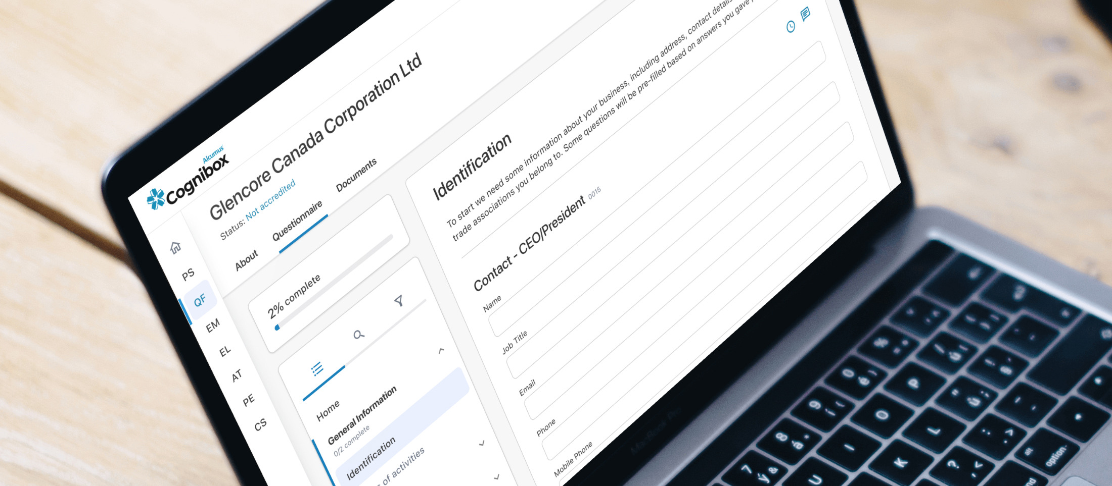
I started out my research by analysing the current questionnaire. The current questionnaire (shown below) is visually dated, tricky to navigate and not responsive.

Understanding user types & journeys
I mapped out the current user journey from initial invite email through to registration, questionnaire completion and submission, and the review stage.


Industry research
I carried out competitor research and also looked into different questionnaire options. This included questionnaire layout and pagination, question layout, question styles (standard or styled form elements), error design, help information and tooltips.

User research
I spoke to stakeholders and also carried out online interviews with existing users to find out how they use the platform. They were shown examples of new questions to validate our assumptions. I shared the findings with stakeholders.

Initial design investigation
Using all the insights I had gathered, I started designing the new questionnaire using our in-house design system. Each element of the questionnaire had to be considered, including:
- Overall layout
- Page layout
- Navigation
- Question styling & status
- Validation options
- Help text & error states
- Showing & saving progress

User testing
After presenting the designs to stakeholders I created a clickable protoype of two design options, and presented them to contractors to get valuable feedback.

This feedback proved extremely valuable and helped me make more informed design decisions.
Design
A new design was created that incorporates the previous user feedback. The design:
- Has a much less cluttered layout
- Uses a clear left-hand navigation so the user can see the length of the questionnaire, what sections they have completed and what requires further work
- A new overall progress indicator - a requirement from interviewed users


Further user testing on these designs is going to take place in November 2023.
This work is still in progress but I’m really enjoying the challenge of such a complicated project, and getting the chance to speak to our users and really make a difference.